The Victor
The adaptive reuse of an icon
The Victor, located in downtown St. Louis, is a thoughtful renovation of the historic Butler Brothers building, originally erected in 1917. This landmark structure has been transformed into luxurious apartments that blend historical architecture with contemporary living spaces. The Victor offers urban living with a touch of history, ideal for those seeking a distinctive living experience in the heart of St. Louis.
When approaching this project, we aimed to appeal to the building's target audience: young professionals seeking a modern, urban experience while honoring the building's place in St. Louis history.
Industry
Real Estate
Visual Identity, Website, Environment
What I Did
The details
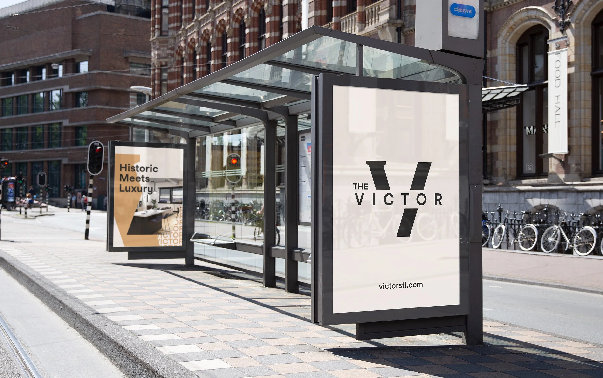
The new logo blends elements of vintage typography to honor The Victor's heritage in St. Louis history with a modern geometric shape that signifies upward motion, symbolizing the building's renewal and promising future. The choice of a simple, geometric typeface for the logotype reflects the sophisticated and modern lifestyle that tenants can expect at The Victor. The brand’s color palette was directly influenced by the building’s interior color palette and finishes.
A bold use of typography and shape add a sense of sophisticated excitement to the brand, capturing the energy of the building’s location next to Downtown St. Louis’ new soccer stadium.
A monumental achievement
I watched for years as the vacant, city block-sized Butler Brothers building stood idle. I had nearly lost hope that anyone would take on this enormous project. As someone who is passionate about the City of St. Louis and its architectural heritage, being involved in this project is something I am incredibly proud of.


